

|
|
|
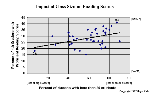
Using a least squares linear regression, the data produced the following relationship:
Y = .145X + 19.66 Points toward the upper right corner of the graph represent states with better reading scores and more small classes; points toward the lower left corner are for states with lower reading scores, and more large classes. What's it all mean? Based on this one nationwide snapshot in time, it is clear that class size has an impact. (In statistical terms, there is a positive correlation between class size and test scores, as seen in the sloped line plotted on the graph.)
How big an impact? Based solely on the data presented here, if the nationwide percentage of elementary classes with fewer than 25 students was raised from 53% to 75%, we would expect the percentage of proficient readers to move from 28% to 31.2%.
|
Want to see more information on how your state compares? Check out our report on How the States Stack-Up.


 Reviews /
Contents /
Sponsors /
Help
Questions or comments regarding this service?
webmaster@superkids.com
Copyright © 1997 Knowledge Share LLC
All rights reserved.